When I talk about setting contrast with a client, I love to drive home the idea that “brighter images are always better images.” At least that is what TV makers slowly lulled the general public into believing and expecting. I take this image from the Monster Cable ISF Calibration disc with a man in a white shirt and I just start to pump up the contrast on the TV. Then if the BD player has its own picture controls, I turn the contrast up further there and I keep repeating the mantra … “brighter is better.” This is me taking an idea to an absurd conclusion, but it really drives home the idea that this type of thinking might be misplaced.

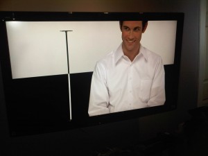
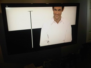
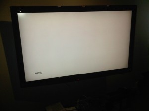
Depending on the display, at the most extreme of contrast settings, all the detail in this man’s shirt will disappear …but at some crazy point … say a setting of 300 … the entire image may just become white and any detail would be completely obliterated.
This image is fun to show the clients because it is a real image and they can associate with what it does to real things rather than on a test pattern. The equivalent on the test patterns as seen in the tutorial videos on contrast are just a series of white boxes with numbers in the boxes. People don’t associate with test patterns and they can agree with you on whatever you say, but when you leave, they say to themselves … “well I don’t watch boxes like that” and they crank the contrast back up again.
The three rules to setting contrast are as follows:
1. No clipping of detail.
2. No discoloration or color shifting.
3. Eye fatigue considerations.
Setting for the first two rules here is the easy part. The third rule about eye fatigue is the hard one to set because there is no one right answer for everyone. I tell my clients that I cannot really set the display to account for eye fatigue because what fatigues my eyes may not fatigue the eyes of my client. The general rule of thumb for eye fatigue is as follows:
“If it hurts your eyes, turn down the contrast.” (or backlight) or …
“If it hurts your head to hit it against the wall, maybe you should stop doing that.”
When it comes to eye fatigue considerations, these four factors are only the beginning …
1. Physical State of Person. (Tired, normal, drunk …)
2. Mental State of Person. (Happy, Sad, indifferent, blind rage …)
3. Program Material. (A jungle movie versus a hockey game)
4. Ambient Room Light. (We can handle a brighter image when the room is well lit, but said image is hard to watch when it is the sole source of light in the room.)
Any one out there heard of the number 35 foot-Lamberts of light output? I know that more than a few enthusiasts have heard of this number and they blindly use it without actually considering where this number comes from. First up, how do you get this number? Take a 100% white windowbox pattern and after you set contrast to meet the first two rules, you take your light meter and measure this box to see how bright it is. If it reads 50 fL, then you would turn down the contrast control until it read 35 fL. If the TV read 28 fL, then you cannot turn up the contrast to get to 35 fL because that would violate the first two rules for contrast. On LCD sets, the first two rules are set with the contrast control and the eye fatigue/light output part is set with the backlight.
So where does this number come from? Well one source would be from THX. They recommend this light output to avoid eye fatigue and THX modes in the various flat panel TVs should not be able to exceed this number even if you turn the contrast to maximum.
Now how did this number get arrived at? It was arrived at with testing in their reference room.
Anyone want to guess what the reference room looks like? Does it look like the typical living room?
The room is completely black and not just with black paint, but fabric. It is a black hole and in this room, it was determined that a light output of 35 fL would not cause eye fatigue. Also sitting at a distance from the TV where the angle of view was roughly 40 degrees.
Ask yourself the question … how many people at home have a reference room that looks like this and sit at exactly 40 degrees viewing distance? (Short of the single men that live alone. 🙂 ) Most people actually have much lighter walls and possibly ambient room light as well. The number was not always 35 fL. Up until 3 or 4 years ago, it was 30 fL. So why did this number change from 30 to 35? It changed because the TV manufacturer got a lot of complaints about how dark the mode was to the point of not being usable. And so the number went up to 35. And if the complaints kept coming in, it could as easily be 40 fL as well.
This stuff in not like Moses coming down from the mountain and proclaiming that the new number is 35 fL and everyone has to rush and adjust their TVs to match.
Reality tells us that everyone’s threshold for eye fatigue is different. One cannot just proclaim one number and say it fits all. (THX did not proclaim this …) Do a study with 100 people and send them into a room one at a time to determine what fatigues their eyes and you do not come up with this consistent 35, 35, 35. What you do end up with is a range somewhere between 30 fL and 50 fL.
The human condition varies … so some will find a light output of 48 fL to be perfectly fine, while others find 42 fL fine. Are they wrong? Does it have to be 35 fL? (It’s actually 35 fL +/- 30%)
If one sits closer to their TV and the field of view is greater than 40 degrees, then a dimmer image is acceptable. If sitting further from the TV with a smaller field of view, then 35 fL might not be enough.
With all these variables it is probably best to just follow our common sense rule of thumb.
“If it hurts your eyes, turn down the contrast.” (or backlight) or …
Here is the final caveat to all this, as if this were not already enough. It has to do with the setting of contrast and the allowable video range. Video uses a range of 16-235 as its basis of going from 0% black (16) to 100% white (235). When the films are mastered, the allowable range on the white end does not stop at 100% or 235. It actually goes all the way out to 254. But unlike the dark end where film makers are trying to hide things like boom mikes and other production items, the stuff above white is meant to be seen. White goes to 109% …
Here’s the rub, while it is permitted to go to 109%, not all films use this additional head room. Some films will simply use 100% white and nothing more (ex. Vertical Limit). Some films will use part of the head room area maybe up to 104% white (ex. Ice Age films) and others will use the entire range to 109% white (ex. White Out). If one chooses to purposely set the contrast to only show up to 235 and not a drop more of detail, they will not be missing anything on many films, but they will on some films. The thing about detail is that if you do not know what you are missing, you tend not to miss it.
Setting the contrast to see the entire range up to 109% white should not be an issue on LCD/LED sets since the backlight control will usually be more than enough to provide ample light output. It becomes an issue on plasma displays because some sets cannot show the entire range of white without severely impacting the light output of the TV. On the Panasonic sets for instance, the THX mode clips white at higher than 246 or roughly 104%-105%. For that display to show the entire range to 109%, the contrast has to drop from a default setting of 60 down to 43. The light output of the picture drops by 50% to get here.
There are 4 main considerations to image quality … in the following order:
1. Good Black Levels.
2. Dynamic Range
3. Accurate Colors
4. Detail-Resolution
Since the dynamic range of a picture is more precious than image detail, some of the high end detail was sacrificed in order to get light output.
If you have a TV where you need to make this dynamic range / detail trade off, make sure that the display does not violate Rule 2 for setting contrast. This is the rule about discoloration. Lots of dynamic range and whites looking pink is the wrong way to go about it.
I should also note that the eyes are not too sensitive to light output changes up to a 30% change. If showing the full range of detail only results in a light output loss of 10%, go with the detail since your eyes cannot see that missing 10% of light output.


3 Comments
Alan Brown
(January 7, 2012 - 12:10 pm)Michael,
Excellent article! However, it is my understanding that the 35 fL target predates the work THX conducted. You should be familiar with Joe Kane’s work with the SMPTE professional monitor working group. ‘A Video Standard’ resulted from that working group, as did the seminal recommended practice documents: SMPTE RP-166 and 167. These documents clarified professional monitor calibration, set up, and environmental practices in the NTSC broadcast and post production arenas.
Critical monitoring and mastering was performed exclusively on CRT monitors of the day. CRTs were the only option for televisions in the consumer world as well. The general approach for monitor use in the approval stage of video program mastering was to use “dim surround” viewing conditions. This was commonly understood to combine a workable average of consumer viewing practice, along with an ambient light level which a CRT display could realistically compete with and still operate linearly. In other words, CRTs were inherently limited in how bright they could get before some type of distortion would occur.
SMPTE RP167 states that 35 fL is the target for peak white, but that 30fL would be the minimum allowed at a 100 IRE level. Even at those levels, a 10% ambient light level was recommended for standard practice. This was for continued critical analysis by technicians for hours on end. To insure consistency, predictability, unity, and reliability for all technicians, the specifications reflect safe averages that would work with a wide assortment of viewers.
Best regards and beautiful pictures,
Alan
tlvexp
(January 7, 2012 - 1:52 pm)Thank you so much for the additional information that clarifies where some of these numbers come from.
Interesting item about the spec being designed based on CRT since there were only CRT sets at the time and how it also addressed CRT weaknesses that may no longer apply to the current digital technologies.
Not unlike the practice of using CRT based color filters to do color and tint on digital displays that may not match the colors of the filters.
Would you recall the viewing distances involved here? Are they the same 40 degrees that THX likes to use or is it something else. This of course is just a person sitting at a work station staring at a monitor.
Best Regards
Alan Brown
(January 7, 2012 - 3:03 pm)The monitors of the day were all 1.33:1 aspect ratio and much lower resolution. Therefore, SMPTE recommended a viewing distance of 4 to 6 screen heights. That works out to 18.878 to 12.648 degrees of horizontal viewing angle, respectively. Consumer televisions, at the far end of the transmission chain, would have reduced resolution and require greater viewing distance or viewing angle.
It is worth mentioning that today’s THX viewing angle recommendation for movies is based upon their methodology for achieving an adequate sense of immersion, not based upon detail recognition/resolution. The world’s standards bodies recommend a 30 degree viewing angle for 1920 x 1080 displays as optimum for detail recognition, and adequate for a sense of immersion.