Calibration Charts Don’t Lie … Guns Don’t Kill People … Spoons made me fat. That last one is a real stretch. This article is about some real life experiences that I and a number of other pro calibrators have had when it comes to graphs and the calibration charts and reports that we give people as well as the reports that are traded between people. In the THX class, this falls under the category of one of the many Tales from the Front Line stories. Stories with a point to them and the lessons that we learned as a result.
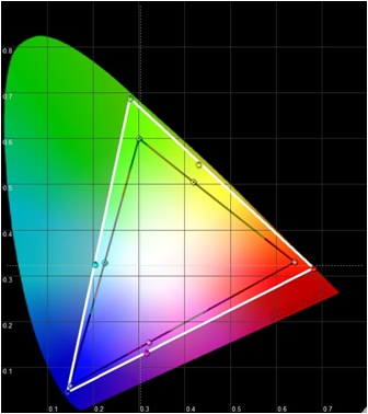
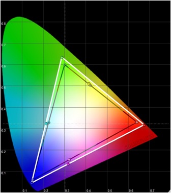
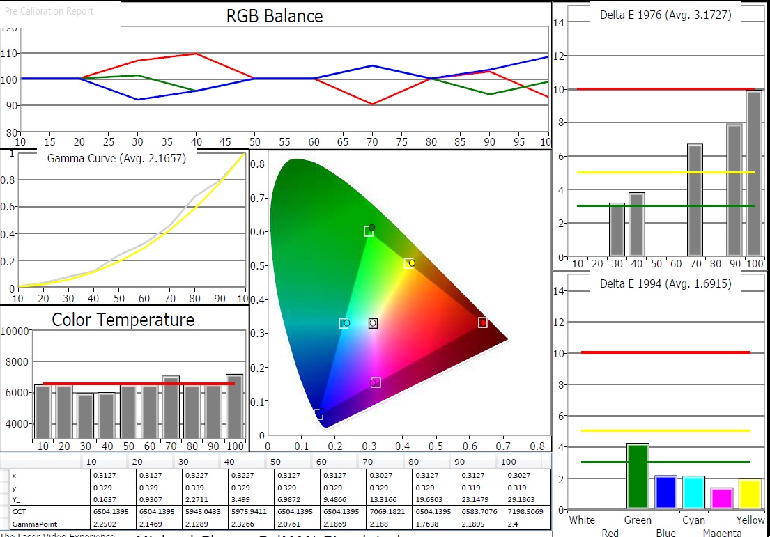
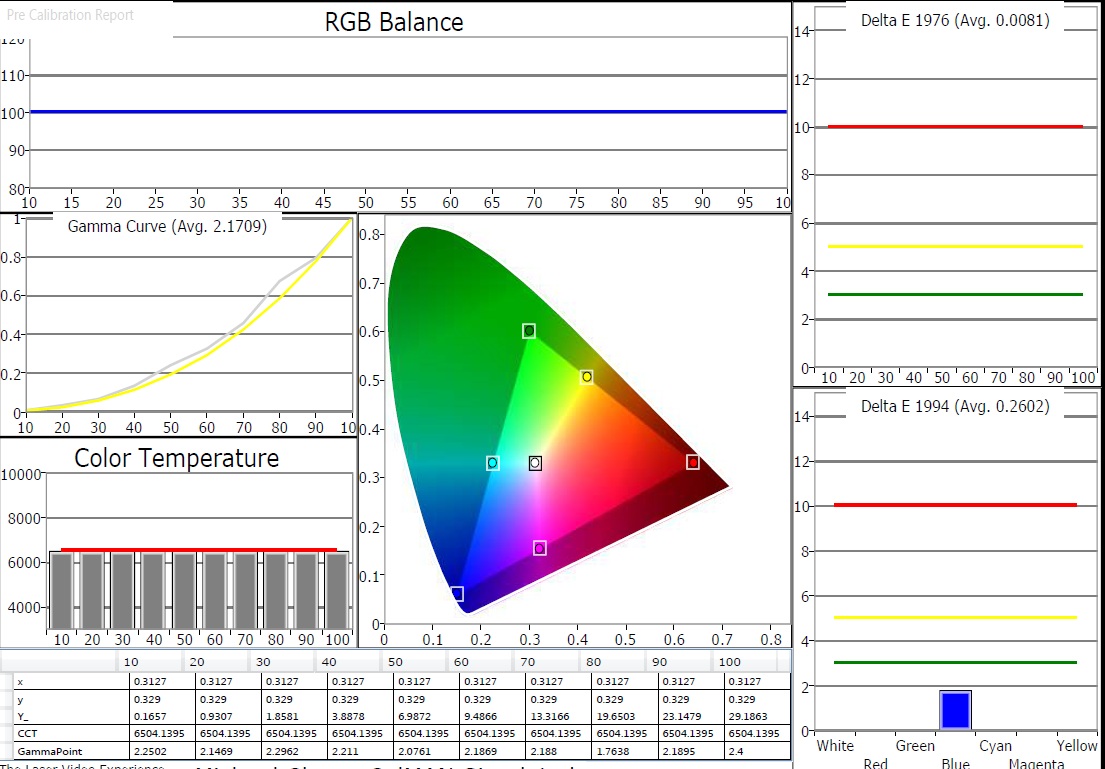
Here are two graphs showing a projector’s original color triangle (in white) versus the desired color triangle in black. The second image shows the supposed post calibration triangle versus the desired color triangle in black again. On the face of it, there looks to be an improvement over where things started out. Although the end result could not match the desired Rec. 709 color triangle, it is better than where it started out. This has to be a positive change. Well things are positive right up until we take a look at Jennifer on the Digital Video Essentials disc.
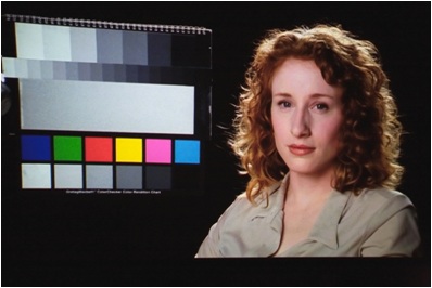
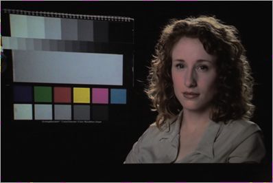 This is what she ended up looking like and below is what she looked like in the original state of the projector before trying to fix the color. But how can this happen because graphs don’t lie … or do they?
I am reminded of a story about a Mitsubishi RPTV from just four years ago that had a color management system that was more for show than something that actually worked right. The calibrator had done many of these units prior to this client so he knew that the system did not work right and did not really visit it during his calibration session with the client. The most he did was spot check it while the client was off on a washroom break to confirm to himself that the function in the TV was still broken and it still was. (Reducing the size of the color triangle would severely desaturate the image and lower the brightness levels of the colors to the point where fleshtones just looked “dead”) The calibration continued once the client got back from the break. By the end of the calibration session, both the calibrator and the client watched the calibrator’s reference material and agreed that images looked as expected and looked very nice. The client tips the calibrator as he is actually thrilled with the end result.
Fast forward a week and the calibration chart of the “before versus after” has been sent back to the client for his records. The client takes this calibration report and decides to post it online at a forum for others with his particular model of TV to take a look. Now things take a turn for the worst. Others in the DIY crowd tell him that the graphs look wrong and that the color triangle information should be tighter … in fact … should be dead accurate as their own graphs attest. The graphs of others clearly indicated that the calibration could have been done better. His graph looks no where near as pretty as those other graphs … generated using gear that cost $150 … versus the $25000 Spectro the calibrator used.
The client has seen all he needs to see and is now unhappy with the results of the calibration. (He was happy just a few days ago) The now “angry” client contacts the calibrator and expresses his concerns that the TV image does not look right and that the graphs of others clearly indicate that more improvements could be had. He even shares those charts with the calibrator as proof that the work was not done correctly. The calibrator is in a bind. He knows that anything he says to the client about the reports of others regardless of the quality of their entry level gear, will be interpreted as simply excuses to cover up something that he did wrong. There is nothing the calibrator can say over the phone or email to defend what he did. The client is 200 miles away, but the calibrator has no choice but to make another visit to the client (and he has to do it soon or else the client will say nasty things about him on the internet.)
So a few weeks later, the calibrator is able to return to the client’s home to view the now “problematic” image. (It didn’t change following the original visit) This time, the calibrator goes into the color management system of the display and adjusts the controls until the graph on the computer looks seemingly perfect. The client thanks him for coming back to address this problem with the TV. He just knew there was a problem with the image. This proves that he was right.
The calibrator then puts up the same reference material that they had looked at the last time. The human fleshtones just looked “dead.” The image was awful. The calibrator takes the color control and turns it up until the fleshtones look right. The client is so happy. The image looks great and he has a beautiful looking graph on his hands. He thanks the calibrator again. But the story does not end here just yet. The calibrator now takes a new set of readings to account for what he did with the color control to fix the fleshtones. The graph has ended up right back to where things started out at the beginning of that session.
The client “gets it.” He finally understood that graphs don’t tell the whole story, in fact, the graphs lied to him. He now feels like a heel and apologizes to the calibrator. The calibrator gets another tip for his troubles. The client has learned the brutal truth of the TV industry which is that controls on the TVs do not always work right. Just because the controls exist, do not mean in anyway that they work right. More often than naught, the calibrator usually gets the sorry task of figuring this stuff out and then delivering the bad news to the client. Sort of like telling your small child that he/she actually isn’t as special as you led them to believe all their lives.
When it comes to calibration charts, there are actually a lot of calibration elements that never make it onto the graph that enthusiasts love to share with each other. Let’s look at some of these elements.
Brightness … setting this right or wrongly never really shows up in calibration graphs. If the brightness control is set wrong, the graph will still look nice and pretty. The blacks will either be washed out now or shadow detail will be lost. No matter, the graph is pretty.
Contrast … Graphs may not always show that the contrast is set too high thus clipping detail or discoloring the image. They won’t show if the image is fatiguing to look at … or too dim given the effects of the viewing environment.
Sharpness … A wrong setting here doesn’t even show up on the graphs at all. There could be an image that is too soft or one that has all this edge enhancement added to the image resulting in a loss of detail. No matter, the graph is pretty.
Overscan / Digital Keystone … The display could still be reducing detail by 50% and the graphs will never show this one way or another.
BD player … Set up wrong. Internal player controls degrading the image before the TV even receives the signal. Graphs won’t show this at all.
Cable box/satellite box set up wrong … The graph won’t be showing anyone this, but that is okay because the graph looks perfect.
A graph tends to represent the fruits of about 30% of the calibration process. It will not reveal the state of the other 70% of the process and if that is not done right … then the pretty graphs no longer mean a heck of a lot at all.
And if all that wasn’t enough for you, then witness exhibit “B” here.
 The true performance of a certain TV is shown first. Then up next is a faked graph for the same TV. Amazing how good this set is. Just look at the graph. The TV can do no wrong.
 The programs have the flexibility to allow the end users to fake their reports to show whatever they want to show. On a display with a two point grayscale control, use the dark end control to fix 10% first … take a reading. Now go to 20% and re-balance the RGB controls to make 20% perfect … take a reading. Now do 30% … now 40% … now 50% …
Now take the bright end control and do the same for 60, 70, 80, 90, and 100. Everyone can enjoy the benefits of perfection. We can even share these graphs with others on the net. It’s not like we are hurting anyone.
Yes sir, a $150 probe can routinely outperform a $12000 spectro. The proof is in the graphs … NOT. This behavior is not restricted to only those in the enthusiast world. Some so called professionals also do this and they can get away with it because their clients have no idea what they are or are not doing when it comes to creating that perfect graph.
Suddenly it is not such a great idea to put so much faith into these beautiful calibration reports. And some wonder why I go through such great lengths in my calibration sessions to downplay the significance of that before and after chart. Let’s stay focused on the prize … the pictures actually have to look right to our eyes regardless of what the graphs tell you. We live for pictures, not pretty graphs.


2 Comments
HT_GUY
(June 2, 2012 - 11:18 pm)Does this only occur with CMS calibration? Or can it also come into play when setting grayscale or gamma (assuming the elements described in the article are set properly)?
tlvexp
(June 3, 2012 - 12:16 am)The faking of a graph can of course occur at any time. The gamma stuff may not always look right especially if one is dealing with plasma displays and the size of the window boxes being used at the time. What looks like a low gamma of 2.05 might actually be 2.20 depending on the size of the windows. So people that use big window patterns and try to hit 2.2 are actually hitting something much higher. Not an issue with LED/LCD though.
Grayscale might look okay on a graph in some cases, but actually be messed up, again depending on the display and what people mucked with. The Pioneer Elite plasma sets, for instance, had a broken CMS that actually altered the grayscale. But usually in the order of how people build their charts; doing the CMS one after the grayscale one; a graph for those said Pioneers might actually look nice even though the grayscale is messed up, but the end user is usually oblivious to this when he shares his graphs with others.
Depending on the tv, sometimes a grayscale chart that looks worse is one with a better looking image. This comes from the need to compromise the grayscale because something in the really dark stuff is color shifting massively and the instrument cannot pick up on it, but the human eyes do. So the mid low grayscale area is sacrificed to make the shadow details near black look right.