There was a time that I would get this question from prospective clients about what services I offered and what they thought the concept of video calibration was all about. People would start to use these superlatives like “POP” to describe what they wanted out of the TV.
To get a good understanding on what display calibration is all about, it is necessary to address a series of myths about calibration. Think of this as a story about what calibration is not about … before we get to what it actually is about. I’ll be using some images to help with this process. The first image is below shown with the Rec. 709 color triangle but more on that in a bit.
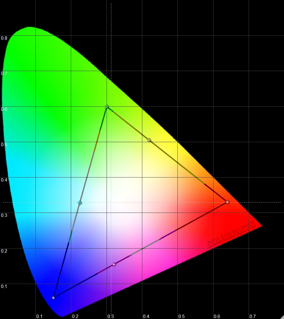
Take a look at this image and tell me what the large color wedge represents? I am not talking about the triangle as denoted by the black lines, but rather the “guitar pick” or “shark fin” of color. What does this represent? Well if we look at the area outside the wedge to the immediate right side of the red area, one would find things like infrared light there. Outside the wedge, but below the magenta and blue areas, one would encounter things like ultraviolet light there. From the perspective of this chart, what do infrared light and ultraviolet light have in common? They are both types of light that the human eye cannot see, so they are not found within the color wedge. By default then, this makes the color wedge contain every color that the human eye CAN see. It is the visible light spectrum for humans.
Now bear in mind that the colors you see in this particular image above are not accurate. The computer monitor that you are viewing it on cannot show you every color that the human eye can see. The depiction is merely for representation purposes only. So the wedge is every color that human eyes can see, but now we focus on the triangle as denoted by the black lines in this image. That represents our HDTV system. Every color you have seen and marveled at on both HD broadcasts and Blu ray disc fits into that triangle. The material contains colors that only fit within those confines.
The first observation that one makes should be that the HDTV color palette looks considerably smaller than what the human eyes are capable of seeing. This leads us to our first calibration myth:
[important]The First Myth of Calibration – “Calibrated images will look real. Calibrated images will look like looking out the window.“[/important]
The last time I looked out the window, the world is not “GREEN” like in the Matrix. The world does not look like the Star Wars world or the world found in the film “300”. What do movies have to do with the real world?
Calibrated images will not look real and cannot look real. The display system simply does not have enough colors to represent this … Deal with it.
If a person somehow promises you some true to life image after a calibration, they are either lying to you or they don’t know what calibration is actually about.
So, calibration is not about making things look real … okay. However, people that consider display calibration also happen to be movie fans or film buffs. I don’t know of one person that hired a calibrator and did not care about movies. If one does not care about movies, then calibrating a display becomes rather inconsistent for a person. Mostly everyone else, of course, is in this for movies because this is home theater after all.
So if we cannot make the display look real, perhaps it is possible to make the display look like what we watched in the movie theater. Maybe calibration will make our display look like film as seen in the theater … perhaps that is a possibility. We’ve all heard people describe calibrated images as looking film-like (whatever that might mean). Well with all that said, it is time to look at the second image that shows us the color palette for Digital Cinema or DCI (Digital Cinema Initiative).
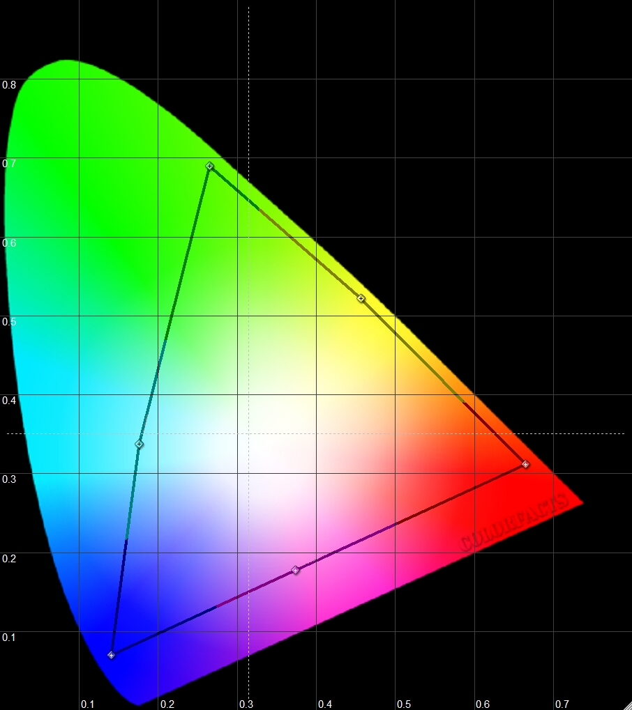
It does not take very long to realize that this color palette is still smaller than what the human eyes can see, but it is significantly larger than Rec. 709, better known as the HDTV color palette. Film has more colors than our TV system and as such, this leads us to:
[important]The Second Myth of Calibration – “Calibrated images will look like film. Calibrated images will look like what you saw in the movie theater.“[/important]
We’ve seen other examples in our lives of this as well. A trip to the Caribbean usually drives this home as do a number of other things we see in real life. The plane lands and you get out and lay your eyes on the color of the Caribbean Sea for that first time in your life. It hits you and you stand and stare at the water because it is a color that you have never seen before. Until seeing the color of the water with your own eyes, seeing the pictures of it on TV and magazine photos never could quite do it justice. You take out your digital camera or your film camera and start to take pictures of this vacation. The flowers, the water, the people are all worth capturing and then you go home. When you develop the photos of this trip, you find yourself flipping through them and then something hits you. As beautiful as the photos are, the color palette in the photos does not look as vivid as you remember. The colors almost look a bit muted and you wonder what happened to your photos.
What you are seeing is that as good as film is at capturing color, it is still not as good as our eyes. But even with the color limitation of film, it is still better than what our televisions are capable of producing.
So calibration is not about film either. We cannot get the presentation to look how it looked in the theater. Our displays do not have that ability.
The interesting part about this is that film makers already know this and have for a long, long time. They know that there is no way the theatrical presentation can be brought to the home and no effort is made to do so. The problem is that there are some film enthusiasts out there that have it in their heads rightly or wrongly that the video presentation must somehow always be as close to the theatrical presentation as possible.
Here is a story from the film world about the making of films that many are not aware of. This story is about the film production company called Merchant Ivory Productions responsible for such films as “A Room With A View,” “The Remains of the Day” and “Howard’s End. (Originally told by Joe Kane.) When this company shoots their films, it is in the post production stage as they are readying the film for theatrical release, where the company often runs out of money and cannot finish the film the way they want to. When the studio gets word of this, the response would often be that it is sad to hear, but contracts have been signed and commitments have been made. (See you in court …) So the film makers are now behind the proverbial 8 ball and must deliver a product.
Fortunately for the film company, they are already in post production and simply in the process of putting together the film they want so a rough cut of the film already exists. With no more funding available, the film company hands over one of these rough cuts to the studio and that version gets released to theaters. The theatrical run proves to be profitable and now the film makers have more money in their hands. They can now finish the film the way that they originally intended, however, they also realize that the film cannot be re-released to the theater since in this day and age, the theatrical value of the film is considered to be over. So the film gets finished within the realm of home video and when you talk to the film makers, they will tell you that the video version is closest to what they had originally intended as opposed to what people saw in the theaters. The theatrical version was merely a work print, a work in progress; something needed to make additional money so that they could finish the film the way they really wanted to.
Just a reminder that what makes it to the theatrical may not always represent a finished product.
Now back to what calibration is actually all about.
Let’s take a look at the creation of the blu-ray version of a film like Avatar. In the production studio somewhere, James Cameron will sit and supervise the transfer of the original film to blu-ray. They will make adjustments and corrections and other tweaks to the film beyond what was seen in the theater because they know that the color palettes are different and this is further down the road in the creative process of any film. At some point in this process, James Cameron would stand back and say that he is happy with what he sees and he signs off on the Blu-ray master. They take this “Director approved” version and create 20 million copies of it on Blu-ray. The question is, what was James Cameron looking at when he said that he was happy with what he saw? Was it a black and white image? Was it in color and if so what kind of colors were they?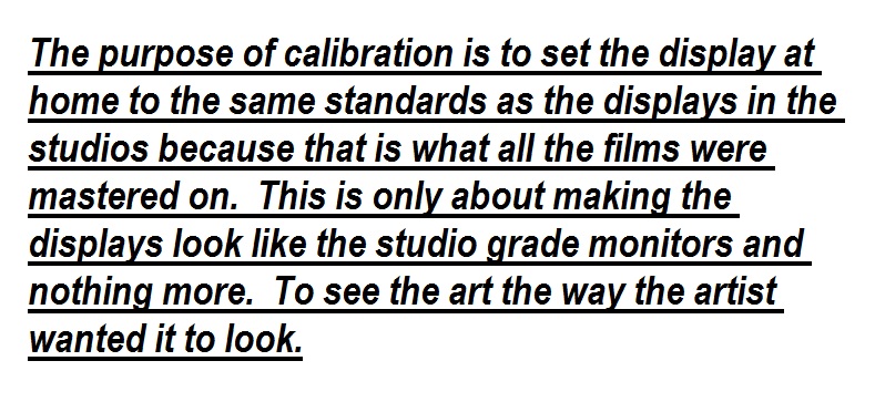
He is looking at a studio grade monitor displaying his film, his art, and this monitor has been properly set up. How will someone at home be able to see what the filmmaker wanted them to see? They have to set up their TV at home to look the same way as the studio monitor. This is the heart of calibration and this point has been lost on so many people including people who actually calibrate displays.
[notice]The purpose of calibration is to set the display at home to the same standards as the displays in the studios because that is what all the films were mastered on.[/notice] This is only about making the displays look like the studio grade monitors and nothing more. To see the art the way the artist wanted it to look.
“2+2=4” That is the goal of calibration. The correct answer is “4” … to make the display look as close to the studio grade monitors as we can. This leads to one of the top questions about calibration by people considering it, but not sure what it actually is. The question is “Will I like what a calibrated image looks like?” The answer to that question is … “2+2=4” Is there a like or dislike component to this equation? Can we say that we do not like it at “4” and would like it to be “98” instead? If the answer is yes, then one really isn’t interested in the answer to the question at all. They want what they want … and those people are not candidates for professional calibration. What is the answer to the question of 2+2=? What is the picture supposed to look like? There is no like or dislike component to this. The answer simply is what it is.
[important]Bonus Myth of Calibration – “Calibrated displays will save energy. Calibrated displays will last longer.“[/important]
The above is completely beside the point. If a person buys a TV and sets it to movie mode himself at home, he will save just as much energy as a calibrated set. If a person buys a TV today and takes it out of the box, it will be preset to some form of factory ECO mode that uses even less energy than any other mode on the TV. If a person leaves his display in this mode, a calibrated display will actually consume more energy, but again, this is all beside the point. Calibration of a display has nothing to do with saving energy. It is about matching the studio grade monitor in performance and standards. To see the art the way the artist wants it to be seen. If calibration as a process consumed double the energy and shortened the life span of the display, we would still do it.
Simple in many ways and yet also amazing that calibration classes have had difficulties explaining this part to their own attendees for many years.


2 Comments
Matthew Rings
(March 26, 2013 - 9:42 pm)Great blog entry! Love getting these myths put to rest for good.
Look forward to reading more and seeing your videos.
Dr. Rings, MD
Aerospace Ophthalmology
Naval Color Vision Research
ordinary colour manager
(February 5, 2014 - 11:36 am)Is TV calibration so worthless? Yes if we only consider rubbish-in/rubbish-out approach. So we must deal with inherent imperfectness, as all is temporary. HDTV with above-mentioned Rec. 709 is also a transition to more flawless UHDTV with more colourful Rec. 2020. Yet I don’t agree that unavoidable inaccuracy changes matters, as long as we will appreciate appropriately a carefully chosen, suitable interpretation. Even reading the above article we don’t see real roundnesses of fonts, we perceive only small pixels. So in assessing a moving picture quality, we must deal with proper understanding of artistically transferred values–in accordance with the above studio displays prescription. Hence other above implied myth: that we can notice or discuss artistry of TV producers. As I’m pro-technical and not emotion-proned, so I vastly doubt in the last.