Color Management System Pie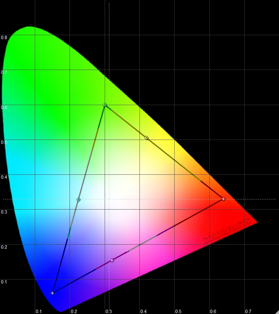 , that’s what I call it. Do we take the whole color pie approach to it or do we calibrate to something less than the full pie? Of course I am talking about color gamuts and whether the calibration process should focus on just the 100% saturation colors along the outer edge of the triangle or something within the triangle.
The answers are never quite as simple as a lot of the enthusiasts or even some of the professionals out there might think. There are rules to this game, just like there are rules to the game “Fizzbin.” See if you can follow along.
The traditional way of doing the color management system of a TV (from the calibration perspective) has been to focus on the x,y positions of the six colors on the triangle. Get those right and the associated brightness of those six colors and all the other colors within the triangle would all fall into place. That’s the theory anyway, especially if we hope that the TVs behave in any linear type of manner. What I mean by linear is that what happens at 100% color along that outside edge also translate directly into what happens at the 75% saturation level and the 50% saturation level and so forth. Perfect color at every location in the triangle.
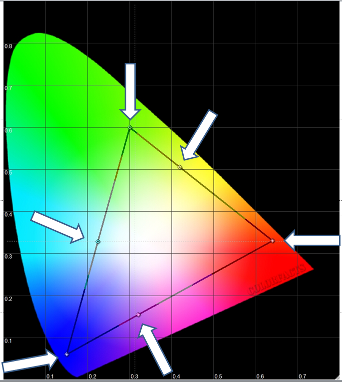
Now because we live in an imperfect world and people want TV sets that they can actually afford to buy, the displays often end up behaving more like this after we do the CMS based on the outer six points. (See below.) The square boxes represent where the colors should be if the TV behaves in that linear fashion that we hope for. The perfect TV would do that. What ends up happening as shown here is that the precision of the colors at the points inside the outer edge leave something to be desired.
 Now the traditional way to do CMS was based on a number of limiting factors including the software programs lack of such a feature and the lack of proper test patterns to do this as well. The entire process was also tempered with the understanding that the human visual system itself had significant limits and no one would be changing that part any time soon. Visually, the human eyes simply are not that sensitive to absolute colors. For example, short of a Red being overtly orange or purple, we can tell you if it is red, but are terribly poor at judging if it is coca cola red or a fire engine red or a Ferrari red. This is the same for greens and blues and every other color. Now put these colors into moving images and it becomes even harder to tell.
Even in the THX class, I would always show the students the gravity of color errors between what the meter can pick up and what people can actually see with their eyes. The meter measures what appears to be a large error in the color, and yet the viewer is unable to visually discern that I made any changes to the color at all. Class after class, no one can tell unless they visually see it change in front of them. No wonder it is generally accepted that once you do the user controls and then add grayscale on top of things, you are said to be at 95% of all possible visual improvements. This comment assumes that the color and tint control worked decently and they actually do on pretty much every set on the market. So with that in mind, understand that this article is about how best to grind away at that last 4% or so of performance. 95% + 4% = 99% …
[notice]No one gets to perfect, ever. The TV is never perfect and the measuring instruments are hardly perfect. “Take back one % to honor the God whose Ark it is.”[/notice]
This is just a theoretical exercise about what methods are available and what might be best. Will a person really be able to see the difference between the methods? Highly, highly unlikely on any real world programming except for one scenario (on wide gamut displays).
The idea is as follows, not all colors in any film that we watch are always at 100% saturation. So instead of working on the 100% saturation points on the outer edge of the color triangle, let’s move inside the triangle and work on the color saturation at 75%. Conceptually, it might be compared to the idea that for grayscale, we want the mid range (40% gray through 70% gray) to be the most accurate because that is where the fleshtones of people are normally found. If flesh tones look right, we have a tendency to then assume that all other colors are also correct. (This is an important point as it ties back into that idea that human vision is simply not that sensitive to absolute colors.)
So now when we do color and tint with a meter, we might focus on the luminance of the 75% saturation red point rather than the 100% saturation point. In all cases though, the luminance is still at 75%. Will this method produce better results than the traditional method? For color and tint, the answer is “NO” because this method forgets the whole reason on why we do color and tint with a meter in the first place. It is about focusing on the color red in order to get the fleshtones correct and not have this thing called “RED PUSH” where red is over saturated/overly bright and we can easily see it. These are the reds close to 100% saturation. We simply don’t visually see overly bright reds at the 75% saturation level. If we set color and tint based on the 100% saturation of red, we will always address the glowing red issues, but doing it at 75% saturation may still leave us with glowing reds.
[important]Once again, be reminded that this is a theoretical exercise and that there will not be any revelations in image quality as a result of this. [/important]
The type of display that you have will impact that end result. This time, we are not talking about things like plasma TV versus LCD versus DLP and so forth. There are two types of displays out there in terms of color triangles. Wide gamut displays and standard gamut ones.
Some sets come with a large native color triangle while others come with one that is close to Rec 709 regardless of what setting you choose on the tv. I have two LG LCD sets … the top of the line and the bottom of the line one from 2010 and 2012 respectively. Set to the Wide Gamut setting, the triangle is no different than if set to rec. 709 or standard …
My JVC projector has a large color triangle by default as does my Samsung “B” Series Plasma set and my Sharp LCD set.
With the standard gamut displays, picking the 75% Saturation points to do CMS might result in better graphical performance than using the 100% Saturation points. Going for a change because it yields a change in a graph, but nothing visible to the human eye would seem to indicate that one has lost perspective on why they got into calibration in the first place. [important] It’s about the movies, STUPID 😛 , not the graphs.[/important]
Wide Gamut displays – When it works, we end up with some interesting results and important decisions to make. First up is the calibration based on 100% saturation points. Look at the errors at 25% and 50% and 75%. They may be greater than at the 100% points where the display was calibrated at, but they are not greater on some massive scale since they still fall into the realm of somewhere from very good performance to excellent. (Turns out in the actual testing that this was not the case for 3 separate displays. Could not find one where this was right, but will continue to look.)
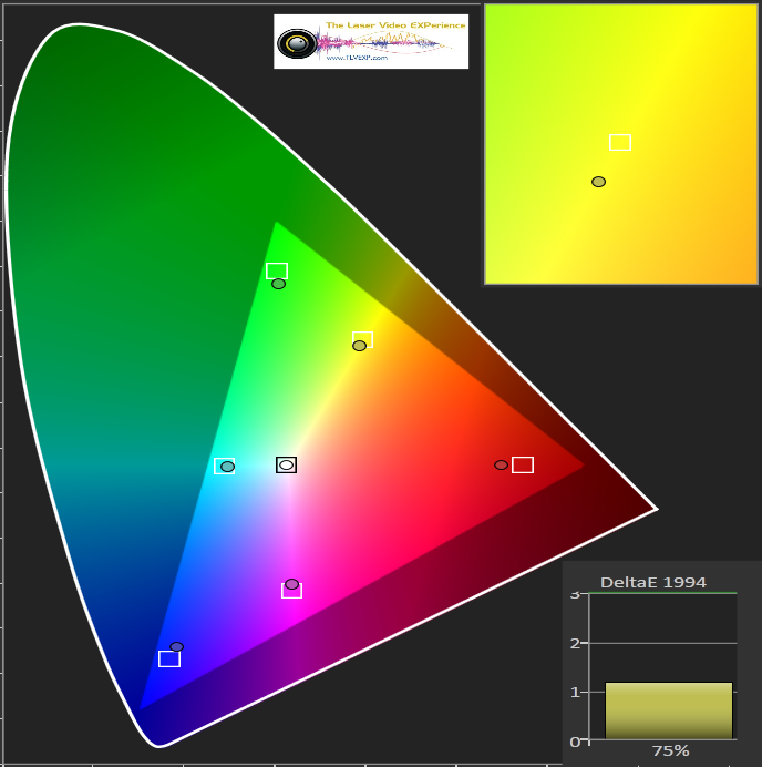
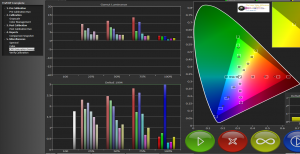
Next up is the calibration based on 75% saturation points. Pay close attention to the errors at 25% and 50% and 75%. Graphically speaking they “might” be improved compared to the performance that used 100% Saturation points. All good so far until you take a look at the errors at or near 100% saturation. There is a very large spike in the errors at this point, large enough that few people can miss this. Below is a relative comparison of my JVC projector using a C6 probe and two color profiles I had set up. The original calibration was done with the Jeti and we are only using the C6 tables here. The profiles are comparable to each other, but the absolute result is not an indication of what the calibrated state really looks like. The tables got close … kind sorta.


In this case, it is debatable if the 75% method was actually a better choice than the traditional 100% saturation approach. The stuff at 25% and 50% and 75% might be considered to be a wash or a tie. The stuff is close enough that it makes no visual difference in real images. Now what is really interesting is what the 75% methodology did to the 100% saturation points. See the color errors spike at 100%. That’s bad. And given our sensitivity to bright colors over darker colors, we will see these errors and they will stand out.
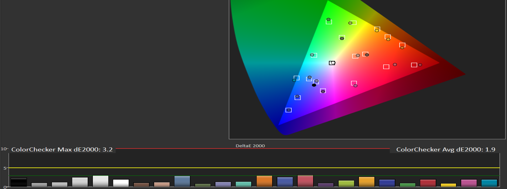
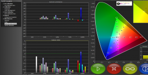
Up next are some images from my Sharp Special Edition series LCD set. Again, kind of a wash on the 25%, 50%, 75% areas. No real differences here. The big difference comes at the 100% saturation area where the 75% method was clearly worse than the 100% method. Note the color checker part that shows both are effectively the same here. The brighter color errors are more visible with the 75% method, much more visible. This is not a total loss though as tweaking the 100% numbers on this set did open my eyes to stuff that was happening at lower levels. I would try to move a control like red tint in the CMS and it only seemed to move a bit. But when you looked at the 25/50/75 levels, that same control was doing massive damage to the colors there.


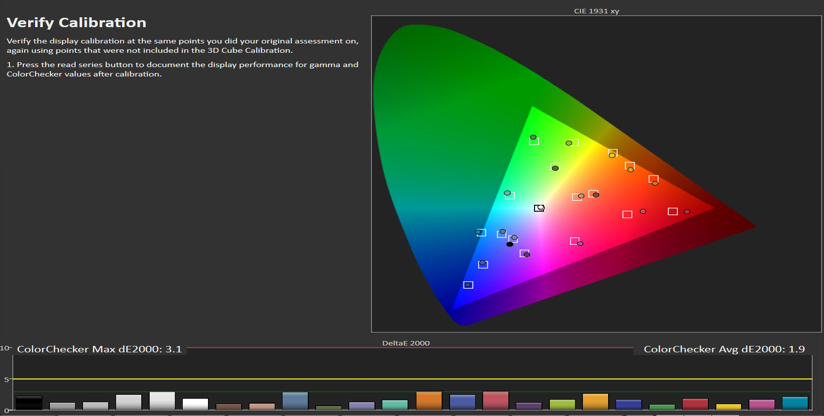
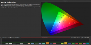
- Sharp LCD at 75% Saturation Color Checker
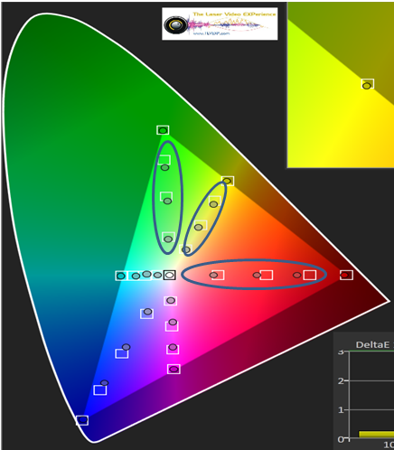
Standard Gamut Displays – When it works, setting the colors based on the 75% saturation point can improve the colors more at the 25% and 50% ranges and all those in between. It is best to compare the results of the 100% run versus those of the 75% run. If the 100% run yielded numbers that had a dE error of less than 3 to start with, then improving on that makes no difference at all from a visual sense. No one can see that level of difference at all. Even if the numbers started at dE 4 and you ended up at dE 3, we cannot visually see that kind of difference. At some point in this process, we also have to remember that the test gear we use is hardly the epitome of perfection either. Below is the color checker plate for the LG LED set based on 100% Saturation. (Not possible for the 75% saturation – see next topic.)

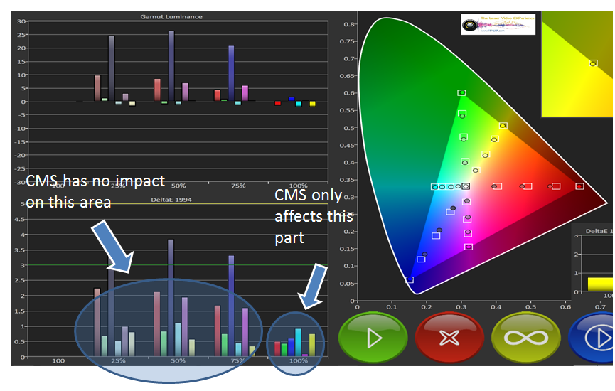
Decoupled CMS in Displays – This is something I never expected to find in the displays on the consumer end nor was I looking for it. My LG LED top of the line TV has a CMS control area that only affects the colors at around 100% saturation. Nothing I do to the CMS controls changes anything at the 75%, 50%, 25% points. These points are all locked in when you do your grayscale (as the canvas in the painting). It looks like this is as good as the colors will ever get on the display, which isn’t exactly that tragic since the errors were all under dE 3 anyway. So on this set, we can only manipulate the colors at 100% saturation. (Shown in the image below as an illustration only.) This makes the CMS control act like one massive placebo. We adjust things and think we are making a big difference, when not much is really happening at all. (Sort of like voting for a President and then finding out that someone else pulls the President’s strings so your vote made no difference at all.) I would have thought that the CMS is somehow incrementally tied to all the colors at all levels, but clearly this is not the case.
Now this gets me think about how many TVs out there on the market with their CMS controls are also just big placebos to fool us into thinking we have more control than we actually do. This discovery has spun my article off in a new direction.
The CMS system in the Sharp LCD was also hampered as the saturation control had no impact at any of the points less than 100%. Only the hue/tint control affected the 75% colors.
So what have I learned out of this whole experience?
- 75% Saturation calibration is interesting in theory, but currently has real life hurdles as many displays are simply not compatible with the approach. Not ready for prime time until technology catches up.
- Color management systems in the TVs are not necessarily designed to accommodate this approach
- External processors like the Duo and Lumagen are needed to even try this approach with some guaranteed result
- 75% approach will drastically mess up what is happening at 100% to get marginal returns at other points on wide gamut displays.
- 100% approach really isn’t that different at points like 25%/50%/75%
- 100% approach should include examination of the 25/50/75 points to see if and how CMS controls are affecting those areas
- Could not find a case where 75% approach was hands down better contrary to theoretical. The data trended in the opposite direction.
- 100% approach is still more viable as an approach to doing CMS.
Addendum – March 5 Update –
I finally had some time to play with my Samsung plasma B860 set. Out of all the sets so far, this one actually had a CMS system that impacted the whole range of colors not just the stuff at 100%. It works right. And what were the results of that analysis?
- Samsung Plasma with 100% Saturation method

- Samsung Plasma 75% Saturation method

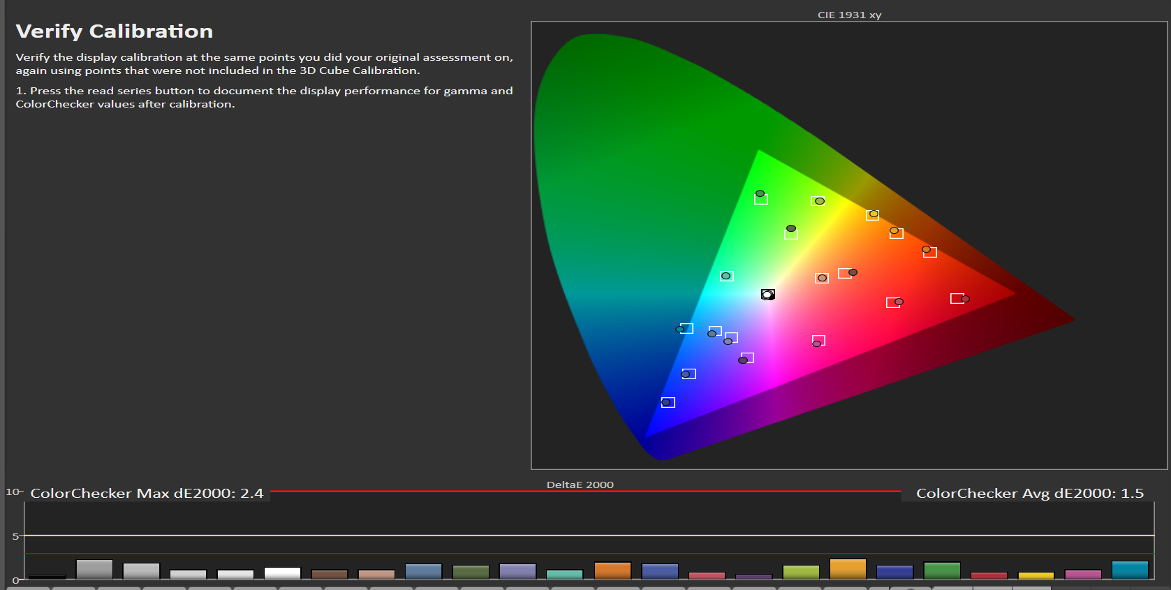
- Samsung Plasma 100% Color Checker


- Samsung Plasma 75% Color Checker
After some disappointment, this Samsung plasma actually behaved according to the theory. The first of all the TVs in my home. I was batting rather poorly up until now. As shown in the charts I have included above, the calibrated Samsung is actually pretty good through the whole color range when done at 100% saturation points. When I step down and do it at the 75% level, things actually get a bit better through the whole range with a small penalty at 100%.
Once again the reminder that we are dealing with theoretical stuff and although the calibration was improved overall, the improvements were still within the realm of being beyond human perception. Nice graphical proof, but nothing anyone will really see on real material.


15 Comments
Brian
(March 7, 2013 - 4:59 pm)Loved this post, very informative. 🙂 Sharp Elite is definitely another set that would benefit from using 75% saturation targets instead 100%. I was unlucky in that I had to replace my 70″ set two time but it gave me a chance to calibrate 3 different sets. And all 3 sets exhibited the same non-linear color tracking issues the Elites are known for.
http://www.avsforum.com/t/1423111/calman-5-release-notes-and-discussion/1140#post_23054224
Wouter
(March 18, 2013 - 12:44 am)Am I right to understand that this also means the much-hyped 125 or more LUT calibrations really don’t bring any visual result compared to a traditional 1 point rgbycm calibration??
tlvexp
(March 18, 2013 - 9:17 am)Greetings
Every new improvement to the TV with each model year makes the picture 100% better. Keep telling yourself this. 🙂 At least this is what they want you to believe. Gotta have it, the next big thing.
The answer to the LUT stuff is both a yes and a no. It will ultimately come down to your tv/display and where it fits in this buffet of variations that I found even with the TVs just in my own home. If your TV starts out close, like my LG for instance, then the LUT boxes will realistically add nothing anyone can see. Think of it like going from 97.5% to 99% on an exam you are writing or heck anything else in life. No rapture or revelation of color. My god, it’s night and day different!!
Now add to this the meter that people might pair up with these LUT boxes. If there is no spectro in the mix, then they are using meter sticks that actually are 102 cm long … now measure it out precisely … and it is still wrong. Will adding the LUT box make people feel better? In many cases, that might be the strongest selling point.
You will be able to make a better informed decision only after you look at the color of the TV at the various levels first with a proper instrument. Better boxes still can’t overcome the human visual system and its inherent inadequacies.
David
(March 19, 2013 - 6:23 am)Hi,
When I go to watch movie at the digital cinema, I always feel like the movie has rich color than blu-ray but not oversaturated. My question is does digital cinema use different color space and white point than bluray (BT 709 standard)?
tlvexp
(March 19, 2013 - 7:06 am)Greetings
Digital Cinema uses the DCI color space. Digital Cinema Initiative. See the article on the Myths of calibration. 68 billion colors versus the 16.7 million of Bluray.
HT_GUY
(March 25, 2013 - 3:23 pm)Regarding setting color and tint, is there any value in checking it at both 100% sat/75% stim and 100% sat/100% stim?
What about the same question but with a full CMS instead of just color and tint?
tlvexp
(March 25, 2013 - 4:58 pm)Greetings
If you are curious, sure why not. But as discussed in the article, the color and tint thing is done based on reds not glowing. They don’t glow at 75% really. That is not what is annoying. Glowing near 100% is annoying and distracting. It’s about fixing stuff you can notice.
HT_GUY
(March 26, 2013 - 3:06 pm)when you say they don’t glow at 75% really, are you referring to saturation or luminance (or both)?
tlvexp
(March 26, 2013 - 3:14 pm)An over saturated green for instance is just an over saturated green. Take the green of the typical JVC projector. It’s way out there beyond where the 709 green is. It’s just an x,y coordinate and nothing more. Nothing says that green is then inherently brighter or darker as a result of those coordinates. Saturation is just on the x,y plane in 2D.
Of course each color point also has a brightness value attached to it … the z axis.
Any reference to glowing would be a brightness issue. There is no glowing on just the x,y 2D plane. Go anywhere on this 2D plane and the brightness is the same.
Rob
(June 12, 2013 - 1:01 pm)Michael,
Can you please tell me the proper (or best) correction approach to take for a projector which, once calibrated ends up with spot-on chromaticity (chart/graph), an excellent luminance graph, a great grayscale with errors across the board less than 2 dE and a perfectly straight gamma of 2.3 – yet ends up with quite oversaturated colors? The out-of-the-box normal color saturation is great, but after calibration for example, ends up frequently with the infamous loud, lime green grass, reds that are too vibrant, Bruce Willis’s t-shirt in Fifth Element a glowing orange and fleshtones in general much too pronounced yellowish golden than when perceived in real life.
How does one tame these oversaturated colors while still maintaining excellent calibration numbers/charts? (I know you mentioned in the post above that “glowing” doesn’t exist in the 2D x, y plane, which is what I should think, too.)
Thank you
tlvexp
(June 12, 2013 - 1:39 pm)Need to know what hardware and software you are using. Your email does not work.
Rob
(June 13, 2013 - 6:32 pm)Sorry Michael, I’m using Chromapure with an i1 Display 3PRO on a Sony VPL-VW95ES.
tlvexp
(June 13, 2013 - 6:58 pm)Sony …. projectors … the color management system on those projectors have never worked right… That RCP thing.
So … you do the basics first … user control stuff … brightness … contrast .. sharpness … et al. Pick the right color gamut … you need to pick one that is closest to Rec 709 …. so you have to measure each one. If it is smaller … then find something bigger.
Then you do the gamma … as in pick the best one … and go with it. It is selectable only … no fine tuning.
Then go do grayscale …
Now do color … Color/tint with a meter method first …
Now since the RCP is kinda broken … focus on getting the brightness of the colors as best you can first. With the RCP.
If you want to play with the hue and saturation of the colors after that to see what happens … experiment with it.
Go watch real material … not test patterns to see how things turned out. Need human flesh tones
If images look funny … you likely have to reset the saturation and hue parts of the RCP.
For more learning, please consider those 7 hours of training videos that I have created.
Terry
(January 20, 2014 - 3:28 pm)Michael,
Am I to understand that you did two meter profiles with the Jeti (reference) to C6. One at 75% and one at 100%. Then, you used the correlating profile for the % target of the calibration?
Michael Chen
(January 20, 2014 - 5:14 pm)It doesn’t matter.